FINAL RESPONSE:
Set of images:
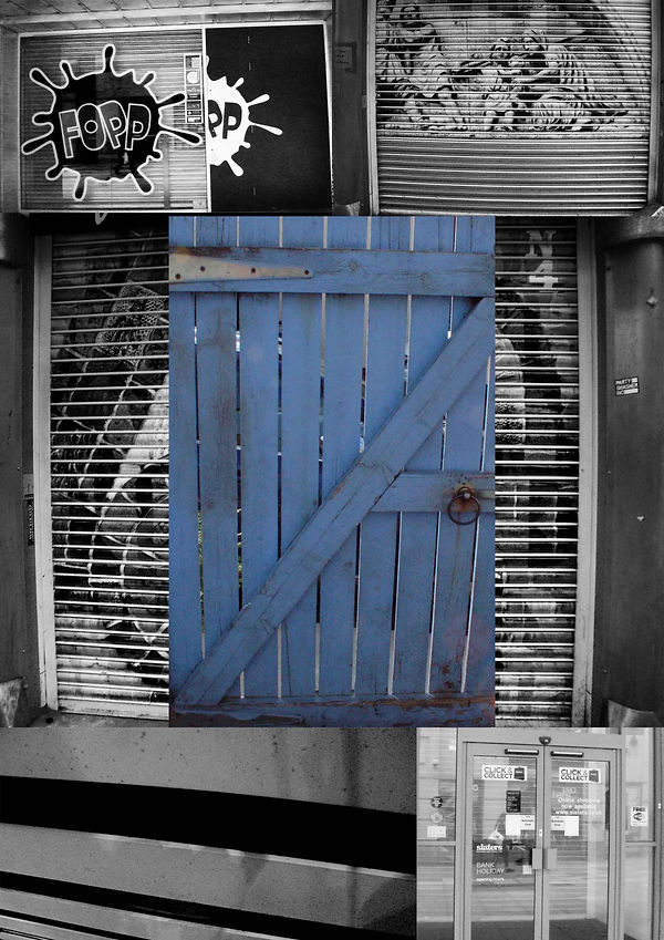
For my first set of images, I have chosen to take six images and make them into a collage of black and white photographs with the pop of colour in the middle. I have chosen to use the colour blue because Daniel Shiel uses various shades of blue and I wanted to see if that looked best with some of my work. All I did to achieve this piece of work was 5 black and white images sectioned on a plain background, touching so that the background is hidden. I then chose to layer the gate over the main image in the middle. I didn’t feel the need to use the blending tool with this edit because I tried it and it didn’t give the effect I was after and it didn’t look good.
The images that I used were a mixture of shutters, a door, a gate and then a counter I was stood at waiting to get a drink. I wanted to use a varied selection of photographs because Daniel focuses on detail and when an image is in black and white, it extenuates the amount of detail in one photograph.

For this second set of images, I wanted to carry on the theme of black and white background with the coloured photograph in the middle. I believe that this works best because I am still following the style of Daniel Shiel but I have added my own twist onto it to make it my own.
I took the picture of the fence and copied and pasted it over and over again so that I had a different texture behind the shutter image.
However, for this edit, I have taken the previous edit and layered another fence panel over the top of it to create a completely new image. To achieve the first edit, I took the images below and placed the coloured over them. I wanted to see if I could take my edits and improve them even further to show my skills. I used a blending mode called 'Vivid Light' to create this piece that I believe makes the edit look better and more urban which is a technique I got from the Manchester shoot.


For this sequence of images, I wanted to create something that was very plain and basic to show how simple it is to create a set of images. I believe that this edit is what reflects Manchester best: the graffiti, the colourful shutters and the cracked pavement. I wanted to try and blend a completely different image on top of the edit that I had done. i got this technique from the 'Pattern and Texture' page from part 1.
I used three images to create the initial edit and then one textured image layered over the top.
For this set of images, it is the most like Daniel Shiel's work because he focuses more on the colour blue which signifies trust, loyalty and wisdom. This was one of the first edit's that I attempted to be like Shiel's work because I hadn't found a technique or style that I liked best. To create this set of images, I took some of the photographs that were similar and changed the colour of each one individually and then created the collage.
For the photograph on the right, I took the image on the left and layered a container over the top using the 'Overlay' blending mode. This created a richer blue and more detail in the edit compared to the first picture. I think that this worked best because it combines the image together fully and makes the image look more blended compared to the first image.


 |  |  |  |
|---|

I wanted to include an edit that was all black and white because I believe that it shows the detail and texture more than colour and with the images I used in the edit, they have multiple different textures in each photograph so black and white and then desaturation worked best with this picture. I combined six different photographs to get the achieved results of the edit. I used brick walls, fence panels, shutter doors and then plain shutters. I edited them to be black and white before I put them in the collage.
I believe that this worked well because it is different from Daniel Shiel's work because it is in black and white compared to colour but the sequence and style are of Daniels.

Some other sets of images with screenshots of how to achieve it:


I wanted to display some of my other final pieces like this so that it was different from others and so that I could show how I achieved my edits the way that I wanted to. I enjoyed displaying my work like this and experimenting with ideas of how to display it compared to part 1 where was had a set task, with my final display, I was able to take the pictures that I wanted to take. This has helped me grow as an artist and will continue to help me in further shoots.